Masterclass on Design Principles for Aspiring Designers

13 Timeless Rules That Make Your Designs Click
Ever stared at your design and thought, “Why isn’t this working?” You played with the colors, shifted the layout, changed the font three times—and still, it just doesn’t feel right.
Here’s the truth: it’s probably not your tools. It’s not your creativity either. It’s that you’re unknowingly breaking a design principle—one of those invisible rules that make things look balanced, clear, and professional. If you’re a self-taught designer, a Canva creator, or someone switching careers into the creative field, these 7 core principles [+ 6 sub principles] are the real upgrade. Once you understand them, you’ll start designing with confidence—and yes, fewer revisions.
Let’s walk through them. One by one. With real context, simple fixes, and examples that don’t require a design degree.
1. Balance: Stop the Design from Tipping Over
Balance is about how visual elements are spread across your layout. When it’s off, your design feels heavy on one side, too empty on the other—or just chaotic. You’ll mostly run into these three types:
Symmetrical: Think mirror image. Great for formal designs like event invites.
Asymmetrical: Different elements on each side, but still visually even. Feels more modern and energetic.
Radial: Everything radiates from a central point (e.g., logos, seals).
Look at your design and squint. Does one side feel heavier? If yes, adjust. Add weight where needed—like a block of text to offset a big image.
2. Contrast: Make the Right Things Stand Out
Without contrast, everything blurs together. You need contrast to create focus—and to make your content readable, especially on digital platforms. Contrast isn’t just light vs. dark. It can come from:
- Size: Big headline vs. small body text
- Color: Bright accent color on a muted background
- Font weight: Bold header + thin subtext
- Shape: A round button in a sea of rectangles
Make the headline bigger, use a different color for your call-to-action, and reduce the number of font styles. You’ll instantly feel more visual clarity. And remember, If everything looks “loud,” nothing stands out. Use contrast with intention—not everywhere.
3. Alignment: Invisible Lines That Hold Everything Together
Ever see a design where the elements seem… slightly off? Like someone moved things around without rules? That’s misalignment.
Alignment helps your layout feel structured and connected. Whether it’s text, icons, or buttons—when they line up, the whole design feels tighter and easier to read.
Types of alignment you’ll actually use:
- Left-aligned text: Clean and familiar. Works best for paragraphs and lists.
- Center alignment: Bold and intentional—but don’t overdo it.
- Grid-based alignment: Use columns or guides to organize content across screens or slides.
Most tools (Canva, Figma, etc.) offer alignment tools. Use them. Don’t rely on your eyes alone.
Try this: Choose one alignment rule for the entire design (e.g., everything left-aligned). Stick to it. Suddenly, your work will feel “designed”—not just assembled.
4. Repetition
You’ve probably noticed how some brands feel completely in sync across everything they create—like their website, social posts, packaging, all speaking the same visual language. That’s not a coincidence. That’s repetition at work. When you repeat certain design elements—like a headline style, button shape, or even just the way you space things—it builds familiarity. And familiarity builds trust. It’s what makes people say, “This looks like them.” But it only works if you use it with purpose.
I’ve found it helpful to decide early on which elements I want to keep consistent. Usually, I stick to two typefaces, a simple color palette, and a few design components that I reuse. That doesn’t mean every layout is the same—it just means they feel like they’re part of the same system. If you’re ever unsure where to start, just revisit your last three designs. Try repeating one element across all of them—maybe a border style, a layout rhythm, or a color treatment. You’ll probably find everything starts to look more connected, almost effortlessly.
5. Proximity
It’s surprising how much meaning we get from spacing alone. In design, just placing two elements close together tells the viewer they belong to the same idea. Move them apart—even slightly—and that relationship changes.
I’ve seen this go wrong so many times in early drafts, even in my own work. A caption too far from its image, a headline disconnected from the paragraph it introduces—it might seem like a small thing, but it instantly adds confusion. The eye has to work harder to make sense of it.
Proximity isn’t about packing everything tightly. It’s about grouping related items so people can understand the flow of information without guessing. When I build layouts now, I treat proximity like a storytelling tool. If something belongs together—headline and subtext, icon and label—I keep them tight. If I want to signal a shift, I give it space. It’s a simple adjustment, but it can change how a design feels almost instantly.
If a layout of yours feels cluttered or disjointed, don’t start deleting things. First, look at how you’ve grouped your elements. Sometimes just nudging things closer—or letting them breathe—solves the problem entirely.
6. Hierarchy
When someone glances at your design, they instinctively decide where to look first. That’s not random—it’s visual hierarchy guiding their eyes. And when it’s missing, everything competes for attention, and nothing really wins. Hierarchy helps you organize content so the most important elements stand out. You can do this using size, color, contrast, position—basically, anything that makes one thing feel more “important” than another. A large bold headline, a pop of color on a button, a striking image at the top—these are cues we all recognize, even subconsciously.
What helped me most was shifting from decoration to intention. I stopped asking “Does this look nice?” and started asking, “What do I want them to notice first?” That small change made everything click. If your layout feels noisy or overwhelming, chances are you’re missing clear hierarchy. Try reducing visual clutter, boosting contrast where it matters most, and letting your design guide the viewer—not just speak at them.
7. White Space
I’ll be honest—when I first heard the term “white space,” I thought it just meant… leaving the background white. I had no idea it could actually be the thing holding a design together. White space is the space around your content, between lines, inside cards, around images—it’s the breathing room. And it’s one of the main reasons some designs feel clean and professional while others just feel cluttered and exhausting.
Once I started paying attention to it, I saw it everywhere. In magazine layouts with big airy margins. In tech websites where buttons don’t compete with headlines. In minimalist brands that somehow feel expensive, just because everything has space to sit and speak.
You don’t have to strip your design bare. But give your elements some room. Let things breathe.
Try spacing things out just a bit more than feels necessary—then walk away and come back. If your eye lands on the right places without effort, that’s white space doing its job.
8. Emphasis
Not everything in a design should be loud—but something definitely should be. Emphasis is what tells the viewer, “Start here.” It’s that one element that grabs attention before anything else. It could be a bold headline, a brightly colored button, or even just a striking image placed in the right spot.
I used to make the mistake of trying to emphasize everything. The result? A layout where every element shouted for attention, and nothing actually stood out. The trick is knowing what the message is—and then letting that message lead the design.
Sometimes it’s a matter of contrast. Other times, it’s size or placement. Even white space can create emphasis by isolating something and making it feel more important. Now, when I design something, I ask myself: “If someone scrolls past this in two seconds, what do I want them to notice first?” If the answer isn’t obvious from the design itself, I go back and adjust until it is. Subtle or bold, emphasis is what brings focus to your work. Without it, everything blends in.
9. Proportion
Proportion is one of those things you don’t notice when it’s done well—but you immediately feel when it’s off. It’s all about how elements relate to each other in terms of size and scale. A headline that’s too small for its section, a button that overwhelms the rest of the layout, an icon that’s oddly tiny in the corner—these things can throw off the entire balance of your design.
What helped me understand proportion wasn’t a tutorial—it was just observation. I started looking at ads, landing pages, even cereal boxes, and asking, “Does this feel right?” And when it didn’t, it was usually because something was either too big, too small, or didn’t match the tone of the rest. Proportion isn’t about exact measurements. It’s about visual relationships. A large image might work next to bold text, but that same image next to thin, tiny font? Probably not. Everything should feel like it belongs in the same visual world. When you get proportion right, your layout flows better. It feels natural—like everything is in its place.
10. Movement
Movement in design isn’t about animation or motion graphics—it’s about how the eye travels across a layout. A good design doesn’t just sit there; it guides the viewer, gently pointing them from one element to the next. You’ve probably experienced it without realizing. A bold headline at the top, followed by an image, then a call-to-action button placed exactly where your eye lands next. That’s movement in action. It’s not flashy—it’s directional.
What surprised me most when I started paying attention to this was how subtle it could be. A slanted background shape, a diagonal line, even a person in a photo looking toward a section of text—it all nudges the viewer’s gaze. I try to design with that in mind now. Before finalizing a layout, I’ll pause and ask, “Where does the eye go first? And where does it go after that?” If the journey feels jarring or scattered, I tweak until it flows better. Movement keeps people engaged. It makes the experience feel effortless—even if they don’t know why.
11. Variety
Design without variety can feel like listening to someone talk in a monotone—technically correct, but hard to stay interested in.
Adding variety is how you keep things visually engaging. That doesn’t mean throwing in six different fonts or clashing colors. It’s more about mixing things up just enough so your layout feels alive. A bold header here, a quiet caption there. A wide photo on one slide, a narrow one on the next. It’s those little shifts that make your work feel dynamic.
I used to go too far with this. One project had three different layout styles in a five-slide carousel—it looked chaotic. What I’ve learned is that variety works best when there’s still a common thread holding things together. Same font family, same spacing system, same color vibe—that’s what creates harmony even when the pieces change. If a design of yours is feeling a little too uniform, try adjusting just one thing: the weight of the text, the placement of an image, the angle of a shape. It doesn’t take much. Sometimes a small twist is all you need to keep someone scrolling.
12. Unity
Unity’s one of those principles you feel more than see. It’s when everything in a design feels like it’s on the same team—even if the elements are different. I didn’t really get this at first. I used to put together great-looking pieces, but sometimes the overall layout still felt disjointed. The fonts didn’t match the mood of the visuals, or the color palette felt like it belonged to another project. Individually, things were fine. But together? It was off.
Eventually, I figured out that unity isn’t about making everything look the same—it’s about making everything feel connected. And that usually starts with decisions you make early on: picking your core colors, your main font, your layout structure. Once those are locked, the rest becomes easier to align. If a design ever feels like it’s trying to be five things at once, zoom out. Ask yourself what ties everything together. Sometimes it’s a style. Other times, it’s just keeping things simple and letting one idea lead.
13. Rhythm
Rhythm in design isn’t something you really think about at first. It’s not as obvious as color or typography—but once you spot it, you start seeing it everywhere. I remember scrolling through a website and realizing how my eye was just… flowing. Every section had this kind of tempo—headline, image, text… then again, headline, image, text. Not identical, but enough to feel steady. That’s rhythm.
It’s not just about repetition. It’s about pacing. You can have variety, but if the layout keeps switching styles too abruptly, the whole thing starts to feel clunky. That’s something I got wrong a lot early on—just dropping in blocks of content with no real pattern. The result felt messy, even if the individual pieces were decent. Now I try to think about how someone will move through a design. Will their eye naturally go from top to bottom? Does the spacing feel too tight in one place and oddly wide in another? Rhythm helps smooth that out. Doesn’t have to be perfect—just intentional.
FAQs: Design Principles for Beginners
Honestly, focus on hierarchy first. If someone doesn’t know where to look on your design, nothing else really matters. Just getting the “flow” right makes a huge difference.
One way is to take an old design of yours and apply just one principle—like contrast or proximity—and see how it changes. Or if you’re part of something like GrowthClub, you can join live design challenges. That hands-on stuff helps more than just reading.
Canva is great when you’re starting—it has simple grid lines and spacing tools built-in. Once you’re ready to dig deeper, Figma gives you a lot more control. If you want to learn more about Canva and gain real world knowledge on how to leverage it, check out our canvapreneur course.
Not at all. Whether you’re working on a pitch deck, a video thumbnail, a website, or even a motion graphic—these principles still matter. They’re just universal.
Simplify. Seriously. Most beginner designs have too much going on. Use fewer elements, give everything some space, keep your fonts consistent, and double-check alignment. Small tweaks, big impact.
Final Thoughts
Design isn’t just about picking the right font or layout. It’s about making choices that feel intentional—choices that help people see, feel, and understand something more clearly. The principles you’ve just explored aren’t rigid rules—they’re the starting points. Quiet frameworks that sit behind every design that just works. You won’t get them perfect every time, and that’s the point. The more you apply them, the more your instincts sharpen. You start to notice when something feels off—and more importantly, how to fix it.
At GrowthClub, this is what we care about most—building designers who think before they design, and who grow by doing, testing, and refining. If you’re just getting started or looking to strengthen your foundation, join the community–keep going. Keep learning. You’re already ahead by caring enough to go deeper.
Your style will evolve. Your voice will sharpen. And with the right principles in your toolkit, you won’t just design something that looks good—you’ll design something that works.
Masterclass on Design Principles for Aspiring Designers
7 Core Design Principles (and How to Actually Use Them)
Introduction
Have you ever spent hours putting together a design and still ended up unsatisfied? Like you can’t really put a finger on what’s missing- whether it’s the fonts that aren’t syncing, or the layout looking off?
Don’t worry, we’ll tell you what it is.
As basic as it might sound, this is directly caused by unknowingly breaking design principles. These principles are like a blueprint to creating polished and refined designs- so making sure that you’re well educated about these essentials are vital and learning how to apply them effectively is not only integral but ultimately what separates amateurs from professionals.
Whether you’re a beginner designer, a career switcher, a Canva-loving creator, or a freelancer trying to build a brand —this blog will help you navigate your way forward.
This is a hands-on breakdown of the 7 timeless design principles — Let’s unlock the design lens you didn’t know you needed.
What Are Design Principles?
Think of Design Principles as rules of visual logic instead of applying them as tools. It’s like the equivalent of math formulas and theorems that you then end up applying to every equation. They help make your design impactful, visually resonant and intentional.
The 7 core principles:
- Balance | Contrast | Alignment | Repetition | Proximity | Hierarchy | White Space
Let’s break down each one and learn how we can strategically use them to create harmonious visuals.
1. Balance
Balance is a foundational principle that refers to how your visual weight is distributed across a layout. In design, visual elements should be arranged purposefully and aesthetically to create a specific look and feel or to achieve a particular goal.
A lack of balance in design can confuse or overwhelm viewers, resulting in a poor user experience.
Most beginners make this common mistake
Without the right knowledge of how to apply Balance to your designs, one can end up placing all text-heavy or image-heavy elements on one side of a composition. The result? A design that ends up looking quite amateurish and off- balance.

How to Fix It
Balance in design comes in various forms, and using it strategically can significantly enhance visual impact. Here are the three most common types of balance
Symmetrical balance, often referred to as mirror-image balance, occurs when visual elements are evenly distributed on either side of a central axis. If you were to draw a line down the center of a design, both sides would reflect each other in terms of visual weight—though the elements don’t need to be identical, they can be similar in number, color, shape, or size. This equal distribution creates a sense of visual harmony.
Symmetrical balance is commonly used to convey formality, structure, organization, and stability in a design.

Quick Exercise:
This is a quick and fun exercise to check for visual imbalance-
Open one of your old designs and blur your eyes. If one side feels heavier than the other? Move or resize elements and adjust until it feels more visually calm.
Here is an examples of Symmetrical Balance in a creative design:


2. Apply Asymmetrical Balance
Asymmetrical balance takes a different approach from traditional symmetry by achieving visual harmony through the intentional use of uneven elements. Rather than mirroring both sides, it creates balance by combining elements of varying size, color, shape, or texture—resulting in a layout that feels more dynamic. This approach brings movement and energy into a design, offering a more organic and creative feel. It’s especially popular in modern, minimalist, and experimental design styles, where the goal is to break uniformity while still maintaining cohesion. By distributing visual weight thoughtfully, asymmetrical balance allows for bold, unique compositions often seen in branding, websites, and poster designs.

Real-World Application:
- You can create a dynamic layout for posters or ads by using large visuals on one side and smaller text blocks on the other.
- Or in the case of website design, you can balance it with a prominent image on one side with minimal text and CTA on the other.
- To guide your viewer’s eye naturally, you can layer varied elements like shapes, textures, colours in presentations or portfolios.
Here is an examples of Asymmetrical Balance in a creative design:


3. Apply Radial Balance
Radial balance is achieved by positioning elements around a central point, resulting in a harmonious, wheel-like layout. Using radial balance in your designs, naturally directs the viewer’s attention to the center, making it effective for designs that need a clear focal point and visual flow. It’s often used in branding to ensure logos or icons instantly capture attention.
This design principle evokes a sense of symmetry and unity, making compositions feel cohesive and well-structured. Radial balance is commonly seen in mandalas, floral patterns, and clock faces, where repetition radiates evenly from the core. When applied thoughtfully, it enhances visual impact and draws emotional engagement through its natural, organic flow.

Other lesser known types of Balance are:

Mosaic Balance
Mosaic balance, also called crystallographic balance, involves placing different visual elements evenly throughout a design without following a specific order. Although it may appear random, this method creates harmony through consistent distribution. It’s especially useful in pattern-rich or texture-heavy designs, commonly used in artistic layouts or backgrounds where visual richness is desired without a dominant focal point.

Discordant balance
Other Ways to Achieve Balance in Graphic Design
1. How does color help create balance in a design?
Strategic use of color can guide the viewer’s eye and balance visual weight. Complementary colors add contrast and energy, while analogous colors promote unity and flow. By choosing a color palette thoughtfully, you can emphasize focal points and maintain harmony across the layout.
2. Can typography affect visual balance?
Absolutely. Typography plays a huge role in layout balance. Using font weight, size, and spacing wisely ensures that type complements—not competes with—other elements. For example, bold fonts can anchor headlines, while lighter text maintains a clean hierarchy.
3. Why is white space important in achieving balance?
White space (also known as negative space) gives elements room to breathe, prevents clutter, and emphasizes what’s important. It creates structure and clarity, making your design feel open and intentional rather than chaotic.
4. How does movement contribute to balance?
Movement refers to how a viewer’s eye flows across the design. By using direction lines, contrast, and spacing, you can guide attention in a way that feels fluid and balanced—even when elements differ in shape or scale.
5. Do patterns help in achieving balance?
Yes, when used well. Patterns add rhythm and visual texture. Repeating shapes or forms across a layout can evenly distribute visual weight and unify the design—even in complex compositions.
6. How do shapes impact balance in design?
Shapes carry visual weight. Large vs. small, symmetrical vs. asymmetrical—how you arrange them affects harmony. Balanced designs often use contrast between shapes to direct attention and create structure.
7. What’s the connection between visual hierarchy and balance?
Visual hierarchy guides the viewer’s focus, while balance ensures no area feels too heavy or neglected. Together, they create layouts that are not only easy to follow but also visually pleasing.
8. Why is balance essential for effective design?
Without balance, designs feel off. A well-balanced composition creates order, draws attention where needed, and keeps the viewer engaged. It ensures that every element serves a purpose and contributes to the overall message.
Common Mistakes to Avoid When Applying Balance
1. Overloading One Side of the Layout
Mistake: Placing too many elements on one side makes the design feel lopsided.
Fix: Use grids and alignment tools to distribute elements evenly.
2. Neglecting White Space
Mistake: Cramming too much content without breathing room.
Fix: Give elements space to breathe by using white space purposefully.
3. Disproportionate Typography
Mistake: Using text that’s too large or too small compared to other elements.
Fix: Maintain harmony by adjusting size, weight, and spacing thoughtfully.
4. No Clear Visual Hierarchy
Mistake: Viewers don’t know where to look first.
Fix: Guide attention with size, color, or positioning of key elements.
5. Relying Too Much on Symmetry
Mistake: Overuse of symmetry can make designs feel predictable or dull.
Fix: Try asymmetry for a more modern and dynamic look.
2. Contrast
Contrast is about difference — between colors, sizes, weights, and shapes.
Let’s face it—no one remembers a design that blends in. Contrast is what makes visuals pop, helps users focus, and gives your layout structure. But did you know contrast goes far beyond just light and dark colors?
For example, your text and background should have clearly different colors to ensure readability and visual harmony.
Below are real-world ways designers use contrast to guide attention and communicate more clearly:

Contrast in Shape
Ever find your eye naturally drawn to one object over another, even when they’re the same size? That’s shape contrast at work. Imagine a smooth, round object sitting next to something sharp and jagged. The simplicity of one makes the complexity of the other feel more interesting—and that’s where your attention goes.

Contrast in Color
It’s not just about making things “look good.” High contrast in color—like dark on light or bold on muted—creates visual hierarchy. A darker shape among lighter ones instantly commands more attention, no matter its size or form.

Contrast in Scale
Big vs. small. Thick vs. thin. Scale contrast is one of the easiest ways to make something stand out. Think of eight identical lines—until one of them is twice as thick. Now it’s impossible to ignore.

Contrast in Layout
What feels more formal: a grid or a free-flowing layout? Layouts set the tone. A tightly structured grid communicates order and discipline, while a looser, asymmetrical composition feels creative, even rebellious. Switching between these styles changes how your message is received.

Contrast in Typography
Fonts do more than display words—they guide the reader. You don’t need 4 different fonts to create structure. A single typeface with varied weights, sizes, and alignment can establish a clear visual hierarchy. Too much variety? That just creates noise.

Type + Color Contrast
Sometimes all it takes is a slightly darker shade. One bold word in a sea of gray can become the focal point. It’s a subtle shift—but an intentional one.

Type + Alignment Contrast
Want to grab attention fast? Break the grid. Stacking bold headlines with off-center alignment or slicing through a color block creates drama. And when done right, it feels dynamic—not chaotic.

Type + Visual Element Contrast
Here’s a trick: place a word that overlaps two contrasting backgrounds—light and dark. That tension instantly pulls the eye and gives the design depth.
3. Alignment
Ever looked at a design and thought, “Something’s just… off”? It very possibly could be alignment done wrong, messing with you. Alignment isn’t just about lining things up to look pretty — it’s about giving your layout some logic. It helps your design feel clean, connected, and easy to follow. When elements are in sync, the viewer doesn’t have to work hard to understand what’s going on. Now think about a bunch of books randomly stacked on a shelf. Even if each book is great on its own, together they just look messy. That’s exactly what misalignment does to your layout — makes it feel scattered, even if the content is solid.
Good alignment guides the eye. It sets the tone. Whether you’re left-aligning text or using a grid to balance images and headlines, you’re helping the viewer move through your design without friction. And honestly? If your layout doesn’t feel right and you’re not sure why… Check the alignment. It’s often the quiet fix that pulls everything together. Alignment gives order to chaos. It creates invisible lines that connect your layout into a cohesive whole.
Let’s walk through the different types of alignment and when to use each for maximum clarity and flow:
Left Alignment
Your best friend when clarity matters.
Left-aligned text feels natural because that’s how most of us read. It’s great for paragraphs, bullet points, and content that needs to feel grounded. Honestly, if you’re unsure what to do — start here. It’s safe, professional, and rarely fails.
Center Alignment
Use it when you want something to stand out — but don’t overdo it.
Centering works well for headlines, logos, or quotes. It pulls focus. But if you center everything, your design can start to feel flat and repetitive. Use it like a highlighter — sparingly, and only when it adds value.
Right Alignment
Less common, but surprisingly useful.
Right-aligning is great for side content — like timestamps, metadata, or quote attributions. It also supports right-to-left reading languages. It’s not meant to carry the main content, but it plays a nice supporting role.
Justified Alignment
Looks neat, but be careful.
Justified text lines up on both sides, which can feel super formal — like a newspaper or printed book. But sometimes it creates weird spacing between words, especially on smaller screens. If you go this route, keep an eye on readability.
Vertical Alignment
Not just up and down — it’s about where you want people to look.
Top alignment is your safest bet for structured layouts. Middle alignment works great when there’s not much content. Bottom alignment? Rare, but can be cool for pricing boxes or product comparisons. Use what feels balanced for your layout.
Edge Alignment
The invisible glue that holds things together.
Aligning elements along a common edge — like a menu, heading, or image row — creates flow and consistency. It makes your design feel neat without looking like you’re trying too hard.
Alignment Tips That Actually Help
1. Stay consistent
If your text is left-aligned in one section and randomly centered in another… it’s going to look messy. Pick a system and stick to it across your whole design.
2. Let alignment create hierarchy
Use it to show what matters most. Want a button to get clicked? Center it. Want your content easy to scan? Left-align everything with breathing room.
3. Use a grid (don’t guess)
Seriously, just do it. A grid helps you space things evenly and keeps the whole layout feeling intentional. It’s not just for “designers” — even basic grids work wonders.
Beginner Mistake:
Elements placed “by eye” without checking alignment — leading to uneven edges and clutter.
How to Fix It:
- Use built-in alignment tools in Canva/Figma.
- Stick to 1–2 alignment zones: center or left-aligned blocks.
- Use consistent margins and padding.
Tip:
Use an 8-point or 4-point spacing system. It instantly improves visual rhythm.
4. Repetition
Repetition means reusing visual elements to create consistency — fonts, colors, icons, shapes. And here’s the truth: repeating things in your design isn’t boring — it’s powerful. If you stick to just two solid fonts or a small color palette, you’ll probably find yourself using the same elements more than once. And you know what? That’s not just okay — it’s actually great.
Let’s say your band poster has one line in bold, blue, italic sans-serif. Feels a bit out of place, right? Like someone hit the wrong style by accident. But if three different elements use that same type treatment? Now it’s intentional. Now it’s a look. Repetition ties your design together. It builds rhythm. It creates familiarity. And this goes beyond one poster or page. If you’re starting a brand or business, this is everything. Your logo, your website, your packaging, your Instagram grid — all of it needs that same visual language.
That’s what people mean when they talk about “brand identity.” At its core, it’s just smart, thoughtful repetition.
Why Repetition Makes a Design Stick (In the Best Way)
If you’ve ever admired a great brand, you were probably noticing repetition — even if you didn’t realize it. Strong brands rely on consistency. You’ll see it in their color choices, typography, shapes, icons, layout patterns, photography style, and even their tone of voice. Whether it’s a bright yellow paired with a bold sans-serif, or a soft tone used across every caption — it’s not random. It’s strategy. None of that happens by accident. Behind every “effortless” brand identity is a series of repeated visual choices made intentionally — to build recognition, trust, and memorability. That’s the real magic of repetition. It turns design into identity. And this doesn’t just apply to logos or packaging.
The same principle works wonders in brochures, pitch decks, websites, or event invites. The more visual consistency you maintain, the more polished and professional the outcome feels. It’s not about doing the same thing over and over — it’s about doing it with purpose.
Here’s another great example: open up any well-designed magazine. Flip through a few pages, and you’ll quickly notice a visual rhythm — consistent margins, recurring typefaces, repeating headline treatments, and image placements. Why? Because it builds a user experience you start to trust and enjoy. You know what to expect — and that feels good.
So the next time you’re looking at a layout, ask yourself:
What elements are being repeated?
Is there a pattern, or is it all over the place?
Does the repetition help create a flow — or does it feel forced?
If the design feels cohesive and easy to follow… you can bet repetition played a big role in that.
Beginner Mistake:
Using different fonts, button styles, or icon sets across one design. It looks chaotic and inconsistent.
How to Fix It:
- Stick to 1–2 fonts max. | Use a limited color palette. | Define 2–3 reusable layout templates.
Real-World Application:
Build Canva templates that reuse the same layout grid and brand colors. It speeds up workflow and creates a signature style.
Mini Challenge:
Look at your last 3 Instagram posts — is the style recognizable as yours?
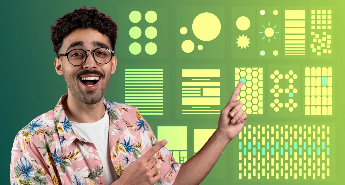
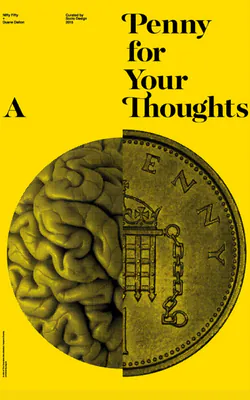
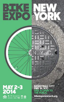
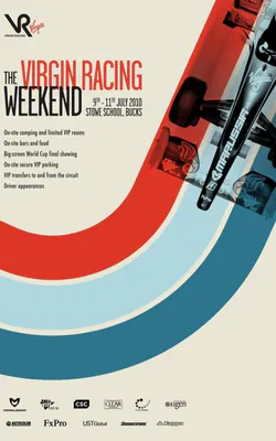
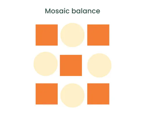
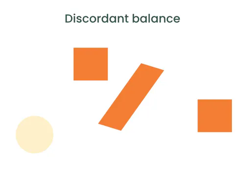
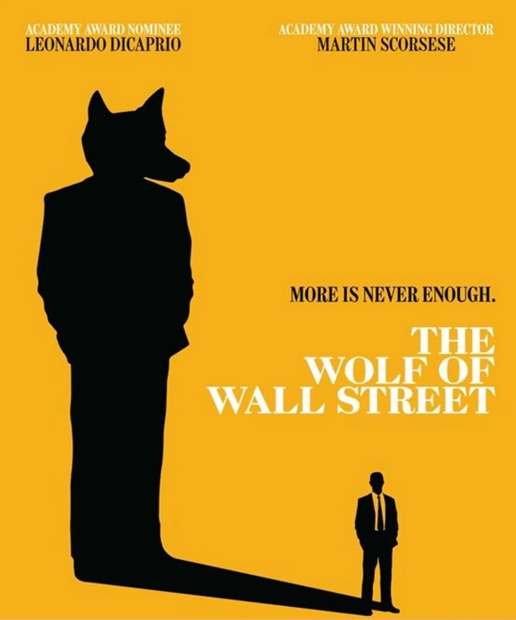
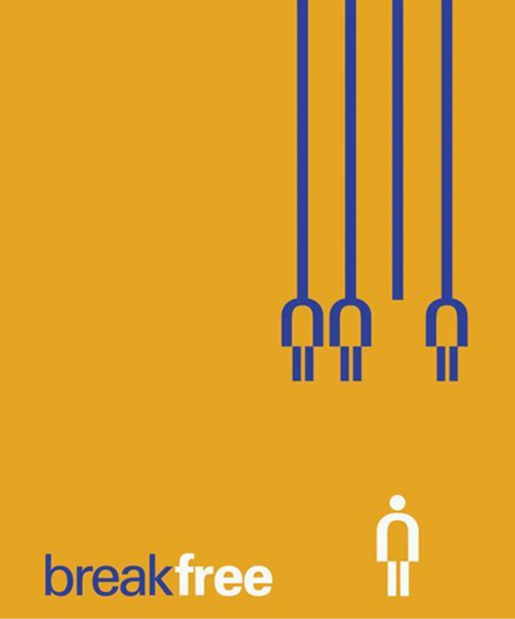
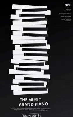
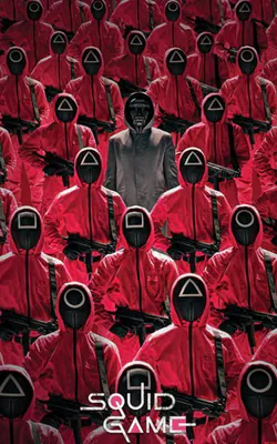
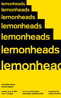
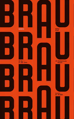
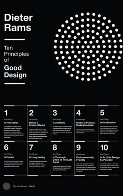
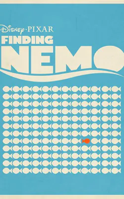
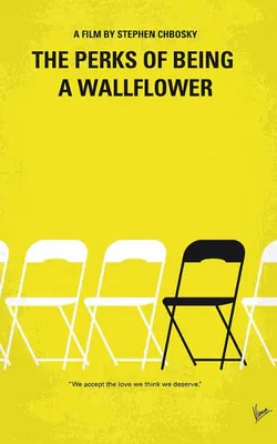
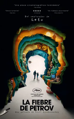
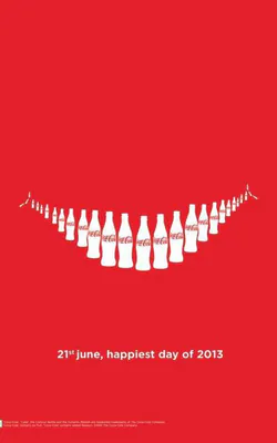
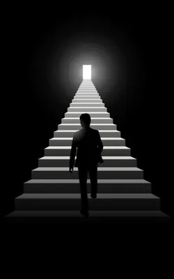
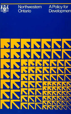
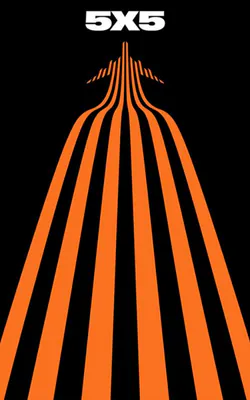
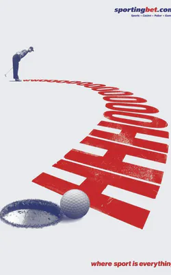
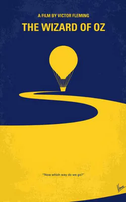
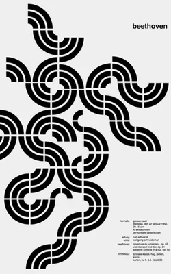
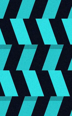
Here are some Examples of Repetition Design Posters:
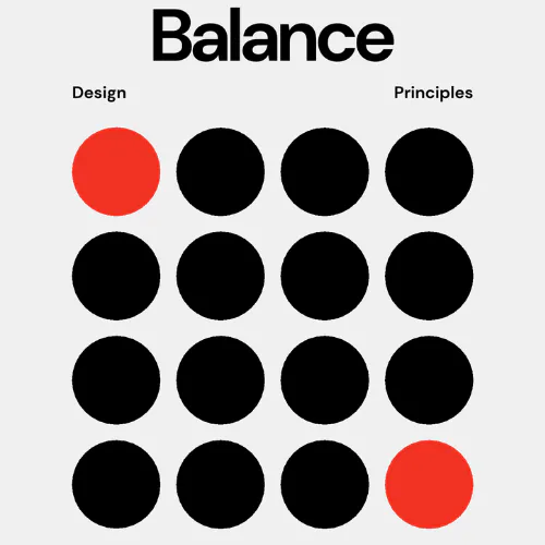


5. Proximity
Proximity is about logical grouping — placing related elements near each other to create connection. It’s basically how close or far things are — and what that makes people assume. Put two bits of text close together? Boom — they’re connected. Your brain’s already reading them as one thought. Move them apart? Suddenly, it feels like they don’t belong to each other.
Designers play with this all the time. Want to keep your layout neat? Group related stuff. Want to separate a call-to-action from body text? Add space. That little breathing room tells the viewer, “Hey, new idea here.” It’s kind of funny how such a simple thing — space — can change how we read everything on a page. Oh, and it’s not just about looking tidy. Proximity affects hierarchy too. It helps people know where to look first, what connects, and what doesn’t. When spacing feels natural, the whole design flows better.
If I’m ever stuck on a layout that’s not clicking? I stop and ask:
– Am I cramming too much together?
– Am I splitting up things that should be tight?
– Is the spacing helping… or hurting?
Most of the time, just nudging a few elements closer or further apart fixes the whole vibe. It’s subtle, but yeah — it works.
How Designers Use Proximity (Without You Even Realizing It)
Let’s break this down — because proximity in design isn’t just about where stuff sits. It’s about why it sits there, and what that placement says to the viewer.
Grouping Things That Belong Together
When related elements are close — like a headline and its paragraph, or an icon and its label — your brain clicks and goes, “Yep, these are a pair.” It makes info easier to scan, read, and absorb.
Now flip that.
Put unrelated things near each other, and it starts to feel cluttered or confusing. Give them space? You’re signaling, “These are different. Don’t mix them up.”
Creating Flow and Focus
Proximity also helps with hierarchy — figuring out what matters most and where the viewer should look next. Want to draw attention to something? Group it near the focal point. Want to lead the eye through a design naturally? Space things just right so they pull the viewer from one piece to the next — almost like breadcrumbs.
It’s kind of like storytelling with space. Each section builds on the last, just through layout alone.
Breaking Ties (On Purpose)
Sometimes, the goal isn’t to group things — it’s to separate them.
By adding more space between two items, you’re saying, “These don’t go together.” Even if they’re the same shape or color, distance changes the way we interpret their meaning. Designers use this all the time to create contrast or to add a bit of visual drama. It keeps the layout from feeling flat — and adds a sense of movement or energy.
Common Beginner Mistakes
Ever looked at a design and thought, “Wait… is that caption for this image or that one?” Or found yourself squinting, wondering if a line of text is a subtitle… or just a random sentence floating around?
Yeah. That’s a proximity problem. When people have to guess what goes with what — the design isn’t doing its job. Viewers should never have to play detective just to understand a layout. If the structure feels random or unclear, it creates friction. And nobody sticks around when something feels like work.
Here’s the thing — good design decisions don’t feel random.
When stuff is placed without thought — whether it’s a heading, a shape, or a graphic — it shows. People can sense when something’s off, even if they can’t explain why. That’s why proximity is so important. Let’s say you place a few shapes near each other — just the right distance, balanced spacing, everything feels intentional. Suddenly, those shapes mean something together. They become part of a larger visual story. Move them just a little apart? The connection breaks. The story’s lost.
It’s kind of wild how our brains work like that. We’ve been wired since childhood to recognize patterns — letters, symbols, logos. These aren’t just shapes. They’re familiar because of how they’re grouped, how they’re spaced, and how they’re repeated.
So, if you mess with that space — even just a little — you change the meaning.
A logo we instantly recognize can suddenly look confusing or meaningless if the parts aren’t close enough. Or worse, too close.
Here’s the real takeaway:
Whether you’re working with super basic shapes or a complex layout, it’s the relationship between elements — or lack of one — that makes a design feel thoughtful. It can shift mood, emphasize something important, or even spark emotion. That’s real power.
Want your work to go from good to great?
Get comfortable with proximity. It’s one of those invisible tools that can quietly elevate everything you create.
Design Prompt:
Try designing an onboarding screen. Can users immediately tell what belongs together?
6. Hierarchy
Okay — so picture this: you land on a website or open a poster. Where do your eyes go first?
Chances are, it’s the big, bold headline. Then maybe a subheading. Then your brain starts scanning. That’s not random, that’s visual hierarchy doing its thing. Hierarchy guides the viewer’s eyes by showing what’s most important. It uses size, weight, position, and color to prioritize.
Hierarchy in design is basically a way to show people what matters — and in what order.
Why’s it useful? A few reasons:
- It helps you organize stuff.
- It keeps a layout from feeling like a jumbled mess.
- It gives your viewer somewhere to start — and somewhere to go next.
- And honestly, it just makes info easier to absorb.
So how do we actually create hierarchy?
Usually, it’s by using contrast. Big vs. small, bold vs. light, color vs. neutral. The thing that pops the most? That’s what people notice first. The rest should follow in a way that feels natural — like a good conversation, not a list of loud headlines shouting over each other.
Here’s a tip:
If your design feels like a wall of content and you don’t know why — check the hierarchy. Ask yourself, “Am I telling the eye where to go next?” If not, time to tweak. When you get it right, even complex messages start to feel simple. That’s the magic of it. It’s not about making one thing pretty — it’s about making the whole thing make sense.
Let’s look at some ways hierarchy plays out visually. And yeah, sometimes it’s obvious. But often, it’s subtle — and that’s the beauty of it. Scale: Size Still Speaks First
Imagine a layout with a bunch of lines going from thick to thin. Your eye almost always starts at the thickest one — that’s hierarchy in scale. The bolder, bigger element just demands attention. Now flip that idea. If the thinner line is made darker or more in-focus, suddenly it feels more important. Even though it’s smaller. See what happened there? That’s where scale meets contrast.
Color: When Contrast Changes the Rules
Take the same shapes, same layout — just switch the colors. A small dark shape might feel bolder than a big light one. Now that tiny stroke? It grabs attention first. Hierarchy shifts just by changing tone and saturation.
Space: Closeness and Overlap = Visual Priority
Overlapping elements feel closer. Our brains read them as more “present.” A shape sitting on top of another isn’t just on top — it’s more important. That slight overlap? It tells a story of layers, focus, and meaning.
Depth & Blur: Focus Guides the Eye
Now let’s throw in a blur effect. Suddenly, even if something is bigger, if it’s blurry, it feels distant. The most in-focus element wins attention. Hierarchy isn’t just about being big — it’s about being clear.
Perspective: Where It Starts Changes Everything
Some layouts give you a 3D vibe — shapes fading into the distance. Naturally, we focus on what feels closest, then move deeper into the background. It’s hierarchy in action, just tilted into depth.
So, What Happens When You Mix All These?
Things get really interesting. Designs don’t always stick to just one kind of hierarchy. Sometimes size, color, position, and contrast all work together — or compete a little. It’s up to the designer to decide what they want the viewer to see first, second, third… and so on.
Let’s check out a few real-life layout examples.
1. Index Page Layout
You’ve probably seen this in a catalog or minimalist site. Each section nudges slightly to the right, and there’s enough white space to make it easy on the eyes. Headings are bolder, body text is smaller, and everything’s aligned with care. Nothing shouts, but the order is clear.
2. Letterhead Design
Almost every letterhead leads with a logo — and that’s no accident. In one design, the logo’s top-left, pretty bold. Next to it? The address block. Below, the message. Then a footer with legal info, set apart with a thinner line and smaller text. Even in this simple doc, there’s a hierarchy: logo > message > footer. And it all feels clean because of smart spacing and typesetting.
3. Experimental Layout
Now it gets playful. You’ve got a title that’s big and bold, but the smaller white text running down the side? Somehow feels even more dominant. Why? Because of the contrast in color, weight, and alignment. It’s not chaos — it’s structured contrast.
4. Magazine Article
A big, creative headline grabs you. Then a subhead, aligned right. Body text? Aligned left. Two different fonts — different sizes too. There’s even a little stroke under the article to say, “That’s it. We’re done here.” Everything’s been placed with purpose — even the whitespace.
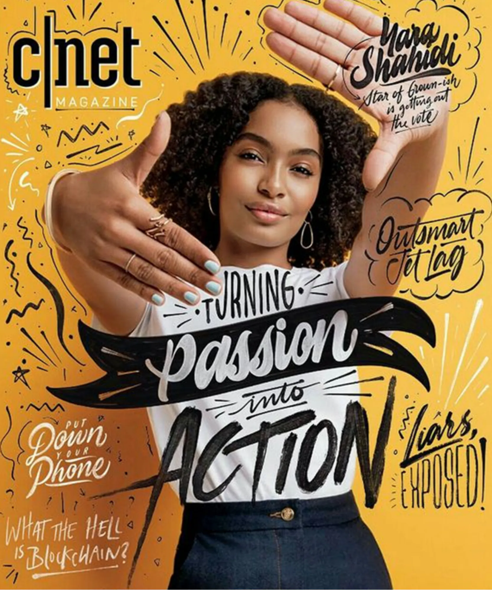
5. Magazine Cover
This one’s a juggle. Usually, one image is the hero — often a person — placed over the masthead. Then you’ve got article titles overlapping the image, each one placed just so. One title might be inside a circle, popping harder than the others. Different typefaces are used, but carefully — they don’t compete, they support. It’s a balance of visual layers telling you what’s hot about this issue.
6. Newspaper Front Page
Unlike a magazine, newspapers want to shout multiple headlines at once. So what wins here? Size. The biggest story gets the biggest chunk of the page. The rest stack in around it. It’s not subtle, but it works — and that’s hierarchy by scale in its purest form.
So, Next Time You Look at a Design…
Ask yourself:
- What do I see first?
- What’s standing out, and why?
- What’s the designer trying to tell me — just with space, size, or contrast?
Because once you start seeing hierarchy for what it really is — a quiet, guiding force — you’ll never not notice it again.
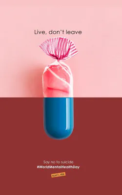
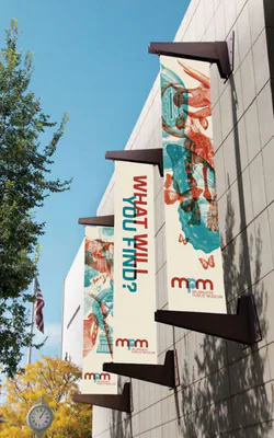
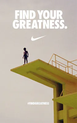
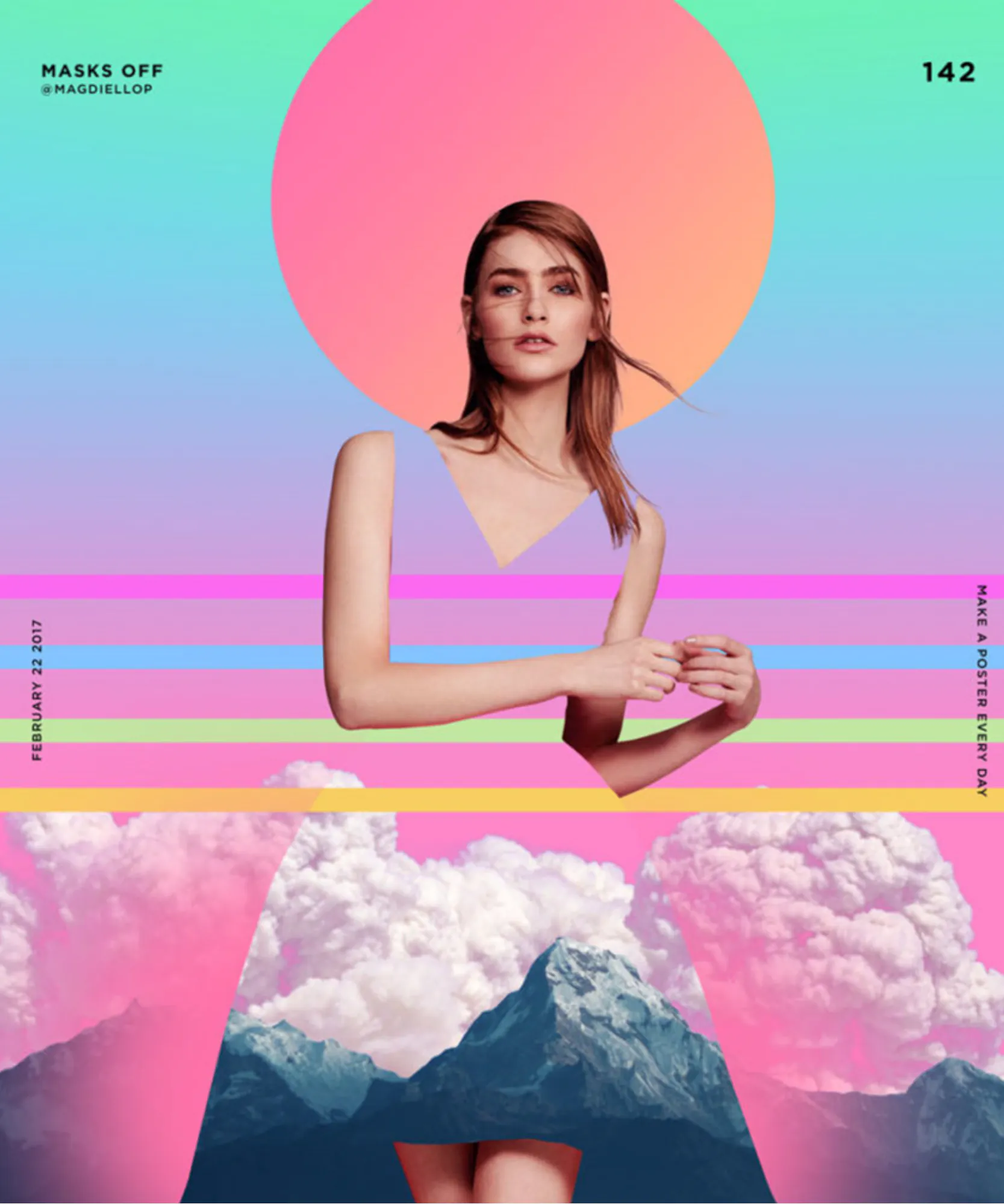
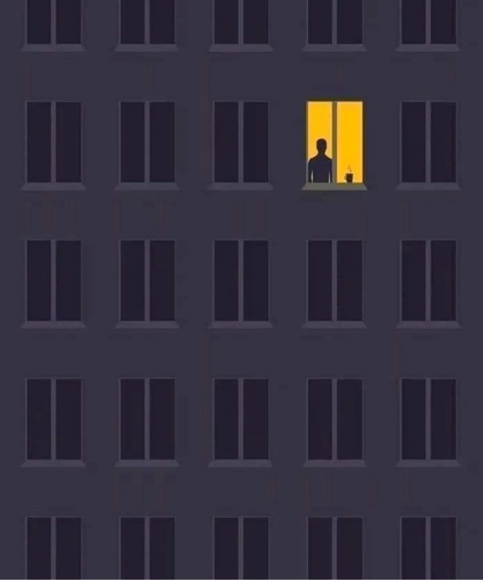
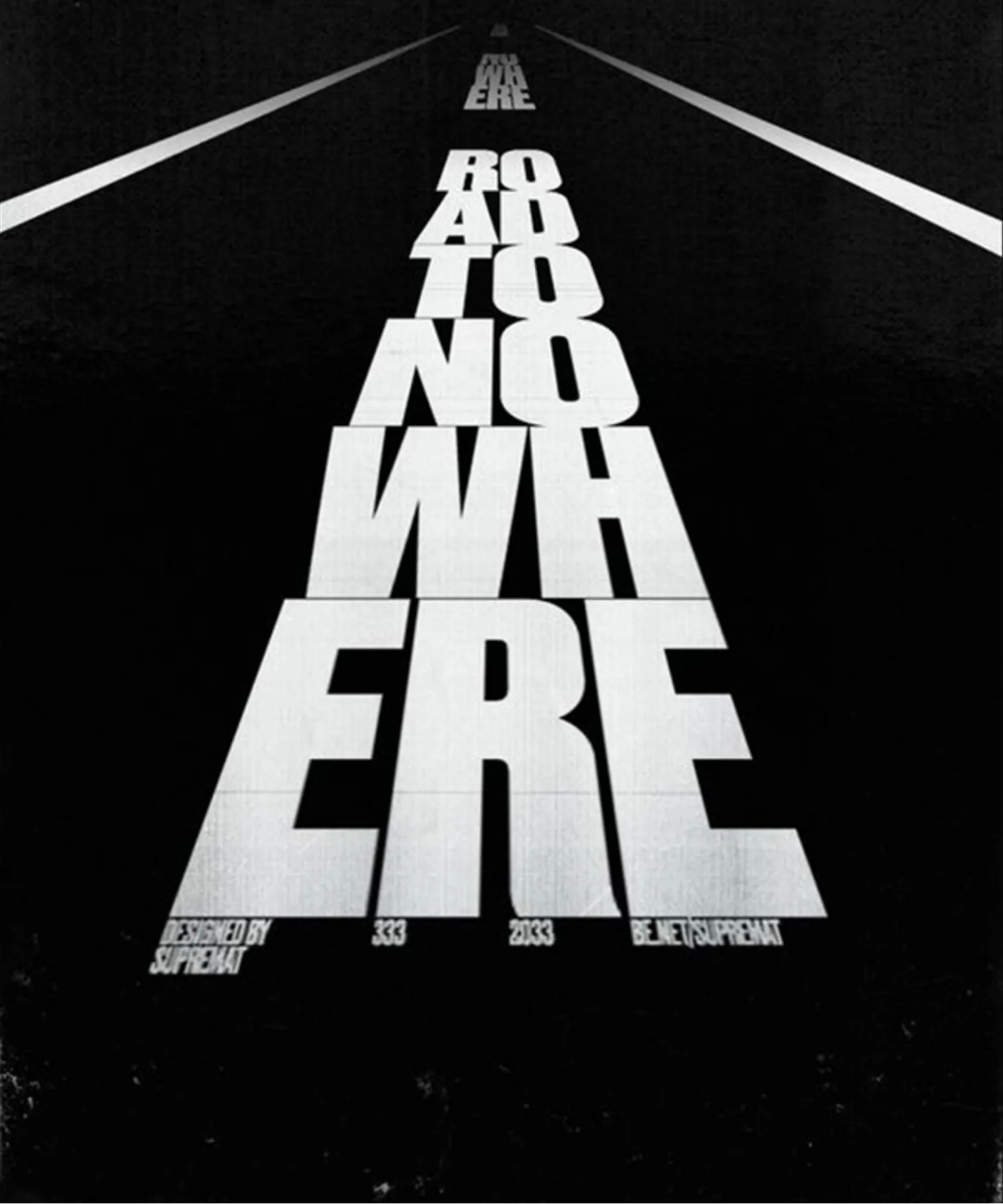
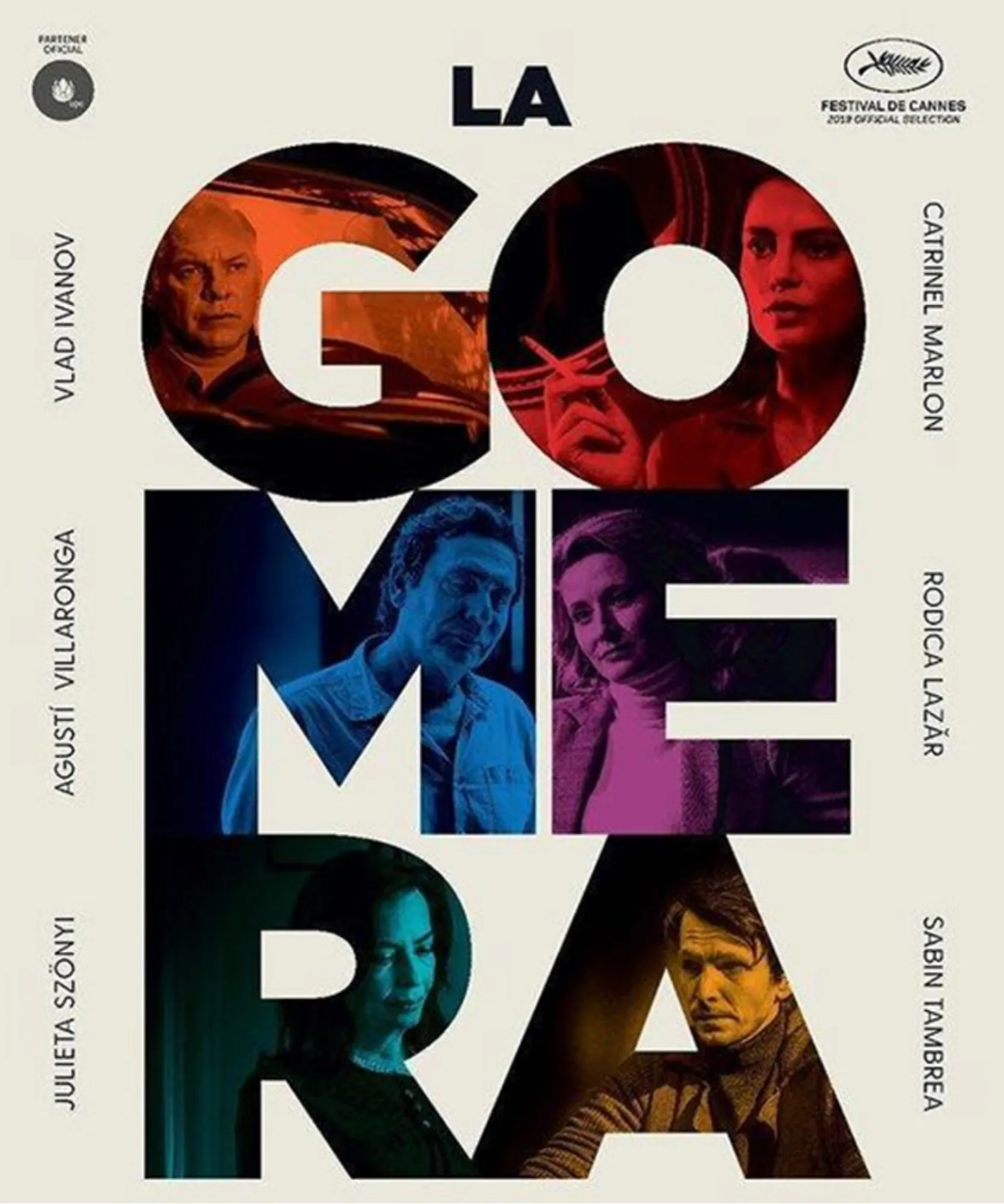
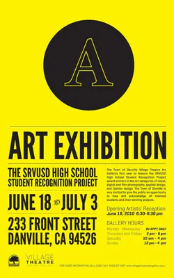
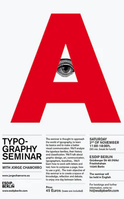
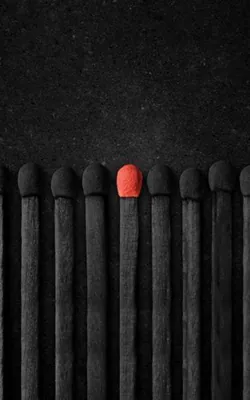
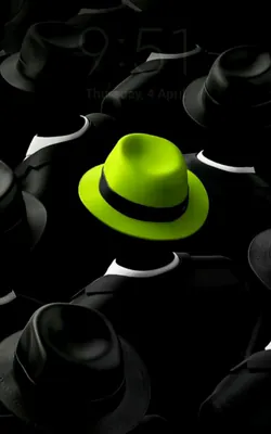
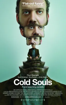
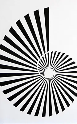
Here are some Hierarchy Design Examples:


7. White Space
Let’s clear this up: white space isn’t always white.
Yeah, the name’s kinda misleading — but what it really means is the empty space around and inside your design elements. It’s that breathing room between stuff: the gaps between images, around blocks of text, between lines, and even inside individual letters. You know that wide margin around a quote that makes it feel classy? That’s white space. Or when a button doesn’t feel crammed and has a little room to stand out? Also white space.
It can be any color — doesn’t have to be literally white. It could be black, a gradient, a textured background, even a photo — whatever supports the design. The key is that it’s not occupied by content. It gives your elements space to breathe and lets the viewer actually focus.
Good white space isn’t wasted space. It’s what makes a design feel clean, organized, and — let’s be honest — less like visual chaos.
Let’s talk about how white space works — because yeah, there’s more than one kind.
Like, yeah, it all looks like “empty space” at first… but there’s actually a lot going on depending on how and why that space exists.
Take this example — if you purposely leave a big chunk of space around a graphic or put all your text down in one corner to let the visual do the talking? That’s called active white space. You’re choosing to give certain elements room to stand out. It’s planned. You meant to do that.
Now compare that to the space that just… kind of happens — like the gaps between letters, or the area around a logo that sits in the header by default. That’s passive white space. It’s not dramatic, but it matters. It’s part of the structure even if you didn’t think too hard about it.
And yeah, there’s also this idea of micro vs macro white space.
Micro is the small stuff — line spacing in a paragraph, padding between buttons, the way items in a menu aren’t all smushed together. You don’t really notice it unless it’s done badly.
Macro is the big-picture space — like the distance between sections on a page, or the blank areas that give your design some breathing room. That’s where things feel either clean and open… or cramped and chaotic.
When it’s done right? You don’t even think about it. But when it’s off, you feel it instantly. So yeah, white space might seem like “nothing,” but honestly — it might be doing more than anything else in your layout.
Real Ways to Use White Space in Your Design Work
Understanding white space is one thing — but how do you actually use it when you’re designing something? Here’s how to make space do the heavy lifting for you.
1. Let Space Steer the Viewer’s Gaze
White space isn’t just about “making things look clean.” It’s also a tool to guide where someone looks first, second, and next. The way you place things — a title up top, a button below, a chunk of text to the right — helps shape how people move through your layout.
Heard of the Z-pattern? It’s a layout trick based on how most people scan a page: across the top, down diagonally, and across again. If you place your content in that path, you’re meeting the eye where it naturally goes.
Quick tip: Leave a little extra breathing room around things people can click — it makes them more inviting.
2. Give Your Text Some Room to Breathe
Nobody likes to read tight-packed blocks of text. It’s tiring. Let your words stretch out a bit. Use decent line spacing (about 1.3 to 1.5 times your font size usually feels good), and keep margins generous. Break longer chunks into smaller paragraphs, and give your titles some space so they can shine. With just a few layout tweaks, your whole design can feel calmer — and easier to take in.
3. Keep Related Things Close Together
Say you’re putting together a page for a product. Would you keep the product photo in one place, the price somewhere far off, and the description hidden below?
Didn’t think so. White space helps group stuff that belongs together — so your images, labels, reviews, and “Buy Now” buttons feel like a single, connected story. Viewers understand what goes with what. It makes navigation smooth, not scattered.
4. Declutter and Let It Breathe
Cramming too much into one space can overwhelm the viewer — fast. White space helps you avoid that trap.
Be deliberate. Leave room between elements. Don’t be afraid of empty areas — they can add calm, focus, and even a premium feel. Try to find balance: if one part of your layout is dense, balance it with a simpler section next to it.
Also, repeating layout patterns — like a block of text followed by an image — creates rhythm. That rhythm helps people move through the page without even thinking about it.
5. “White” Doesn’t Mean White
Despite the name, white space doesn’t have to be white at all. You can use black, beige, textured backgrounds — even full-blown images — as long as the space gives your content room and contrast. What matters is clarity, not color.
For example, a black-background site with bold elements spaced well? That’s using white space — just in a different tone.
Quick Test:
Take any one of your recent designs and ask yourself:
“If I removed 30% of the elements, would it still work?”
If yes — great use of white space.
If no — try redesigning it with more breathing room.
8. Emphasis
Not everything on a page should shout. But something should speak first. It could be a bigger heading, a splash of color, or a shape that quietly takes the lead. That’s what emphasis does — it helps one element guide the eye, so viewers aren’t left wondering where to begin.
Designers don’t just add contrast to make things loud — they use it to make things clear.
When Less Is Meant to Be Less
Now, not everything deserves the spotlight. Think of the small print at the bottom of a poster or the soft grey footer on a website. Those parts still matter — just not as much as the headline. Shrinking the font, muting the tone, or placing it off to the side — it all helps reduce the visual weight. That’s still emphasis — just flipped the other way.
Good design knows what to show… and what to quietly let sit in the background.
How to Make One Thing Stand Out
If you’ve ever looked at a webpage and felt like everything was yelling at you, you’re not alone. When a layout tries too hard to make every element important, it ends up making nothing feel special.
Here’s how you can create focus — without overwhelming the whole layout :
1. Size Does a Lot
Let’s be honest — we look at the biggest thing first. A huge “SALE” or “50% OFF” will pull your eyes before anything else. Bigger = louder (visually, at least).
You don’t need to go overboard. Just make sure the important bit isn’t fighting for space.
2. Color Is Your Secret Weapon
Try using a bright or odd color to call attention to something. Everything black-and-white? Drop in a red box. Boom — instant focus.
You could also reverse it. Make everything loud — then one quiet, calm piece stands out even more.
3. Mix It Up
Contrast isn’t just about color. Try pairing a funky shape with straight lines. Or using a clean font, then switching it up for one section. When things are mostly the same, even small changes pop.
4. Throw in a Curveball
Ever see a design with one thing that’s just… different? Maybe a bold sketch. Or a playful font. It feels fresh, right? That’s novelty doing its thing. Just don’t do it everywhere.
5. Add Some Style (Your Kind)
You don’t need fancy tricks — sometimes just sticking to your brand’s vibe is enough. Vintage, clean, loud, chill — whatever it is, use that style to guide attention naturally.
What About the “Background” Stuff?
Here’s the other side: subordination. It’s just a fancy word for knowing what not to highlight. That tiny disclaimer at the bottom of a flyer? It’s small for a reason. We don’t need it yelling. We just need it there — present, but chill. Use soft colors, smaller fonts, and place them where they don’t interrupt the main story. That way, people still get the info without losing focus.
A Quick Challenge for You
Open your current design. Now ask yourself: What’s the first thing your eye goes to?
If it takes more than 2 seconds to figure that out, you might need to tweak the emphasis.
Here are some design examples related to Emphasis:


9. Proportion
In Design, proportion refers to the relationship between objects with reference to their size and visual weight. It is one of the easier design principles to understand that mainly focuses on the comparison of shapes and sizes of elements in relation to another. Ever looked at a poster and felt that maybe the image is shouting louder than the headline? Or one part looks way too small for no reason? That’s proportion — doing its thing (or not).
Proportion is basically how things relate to each other — size-wise. One element feels bigger, smaller, more important, or just… weird. Designers use it to make layouts feel natural, balanced, and sometimes even surprising. When things are in proportion, your eye just gets it. Nothing feels out of place. But when it’s off? You might not know why — you’ll just feel it.
Why Proportion Really Matters
Imagine walking into a room where the furniture is all out of scale—giant chairs, tiny tables, oversized lamps. That unsettling feeling? It’s the same when proportions in a design are off.
Proportion helps tell your audience what to focus on. It signals what’s most important and keeps the layout from looking cluttered or chaotic. Sometimes, breaking proportion intentionally can create a cool effect or highlight a key idea—but it has to be purposeful.
Two Kinds of Proportion to Know
There are two common ways designers think about proportion:
1. Context-Based Proportion
This deals with what we expect. For example, an elephant with a tiny trunk will feel “off” because we know elephants usually have large trunks. Our brains have a baseline for what’s normal.
2. Relationship-Based Proportion
This one’s more about how objects relate to each other in the same scene. If an elephant’s eye is bigger than its trunk, even without outside reference, it still feels wrong. The elements just don’t match up well.
In design, we use both lenses. Whether you’re making a poster or a product mockup, getting those visual relationships right makes a big difference.
Common Proportion Pitfalls
Most people don’t notice good proportion—but they do notice when it’s missing. For example, if a face illustration has one eye larger than the other (and it’s not for style), it feels off. It’s distracting.
Designers aim to avoid this by checking relationships between all parts of a layout from the start.
Four Practical Ways to Use Proportion in Design
1. Compare Dimensions: Height, Width & Depth
Take something simple like a box. If one box shows all three dimensions and another doesn’t show depth, they won’t feel like they belong in the same scene. Balanced proportions make sure every shape holds its place.
2. Size Relationships Between Elements
If a house in your design is smaller than a person standing next to it, your viewer will instantly feel confused—unless you’re using perspective to create that illusion.
3. Compare Areas
Sometimes, it’s not about the objects themselves but how much space they occupy. If one section of a page is super cramped and another has way too much room, it feels lopsided.
4. Understand Relationships
Objects make sense in context. A leaf is small next to a tree but large next to an ant. Keep this in mind when designing compositions—things don’t just need to look good alone, but together.
Proportion is less about math and more about how everything feels together. When it’s working, your audience flows through your design naturally. When it’s not, they hesitate or get lost.
And yes, sometimes playing with proportion can be a creative move. But like all design rules, you need to know it well to break it well.
So next time something in your layout feels “off,” check the proportions. It might just be the fix you need.
Here are some design examples related to Proportion:


10. Movement
Ever noticed how some designs just feel… alive? Like your eyes are being pulled, guided, almost like someone’s giving you a tour without saying a word. That’s movement in action — one of design’s most underestimated tools. At first glance, movement might sound like something only action scenes or animations need. But the truth is, whether you’re designing a poster, a web layout, or a branding piece, movement is what keeps the viewer’s eyes from getting stuck. It’s the unspoken rhythm that makes people want to keep looking.
Designers use lines, contrast, rhythm, and positioning to make sure the viewer doesn’t just look at the design — they move through it.
Sometimes, movement means action. Like showing a character leaping or wind blowing through hair. But often, it’s just about quiet direction — using shapes, spaces, and colors to gently lead the way.
Rhythm & Repetition: Giving the Design a Beat
Have you ever looked at a tiled floor or a row of evenly spaced trees and found your eyes naturally following along? That’s rhythm at work. It’s built through repetition — using similar elements (shapes, lines, or forms) with a predictable pattern or flow.
Rhythm gives a design tempo. It tells your eyes, “Here’s where to go.”
Color & Contrast: The Gentle Push of Attention
Color can do more than decorate — it can guide. And when you use contrasting colors (like light on dark, or warm against cool), your design gains a clear focal point. Want someone to notice something first? Use bold color contrast. Want them to drift gently from one area to another? Soften the contrast.
Leading Lines: Visual Arrows That Point the Way
Lines are one of the easiest and smartest ways to add movement. They don’t even have to be literal. Think about the way someone is facing, or the direction a road curves. That’s an implied line, and it still works.\
These lines — whether drawn or simply suggested — guide your viewer without them realizing it.
Implied Movement: Still Images That Feel Alive
Even in a static design, movement can be felt. A dancer mid-jump, a scarf fluttering in the wind — it’s not moving, but it feels like it could.
To pull this off, you need energy in the pose. That’s where the line of action comes in — an invisible curve running through the subject that suggests flow and dynamism.
Movement in the Real World
Movement isn’t just for fine art or comics — it’s everywhere:
- In fashion, it’s the way a dress flows as someone walks
- In web design, it’s how the layout leads you to a “Sign Up” button
- In retail, it’s how displays pull your attention from product to product
Designers use movement to shape experience. Whether they’re trying to make a brand feel bold, graceful, or fast — movement helps deliver that message without words.
Design without movement can feel flat — like a song stuck on one note. But when you use rhythm, contrast, lines, and action thoughtfully, your design comes to life.
Mini Design Challenge
Take one of your past designs. Show it to someone and ask: “Where did your eyes go first?” If it’s not where you expected, try adjusting a shape, a line, or a splash of color. Watch how the journey changes.
That’s movement — in motion.
Here are some design examples related to Movement:


11. Variety
As a design principle, Variety refers to disrupting a particular composition to break the monotony. As the word itself suggests- it is about bringing in some varied change that elevates your design and draws in interest.
Variety can be added through many aspects like:
- Repetition | Rhythm | Shape| Colour | Texture
But Variety only stands out when blended well with Unity.
But, what is Unity?
If variety refers to change that breaks monotony, Unity is the coming together of different elements as ONE. When Unity and variety is appropriately balanced & used in a design, you can create a unique and aesthetic result that actually stands out. If only unity is used, your design, while consistent, might end up turning out bland and flat, and too much emphasis on variety can cause disorganized chaos.
12. Rhythm
You might find it strange that a term like Rhythm which is usually used in the context of music or dance is a Design principle. This is because, much like music or dance, design is also ART.
Rhythm can be created through repetition of certain design elements in a particular order and flow with the intent of guiding the viewer’s eyes through the layout to spark visual interest and add a visual pulse.
We have 3 main types of Rhythm
- Repetition | Alternation | Progression
Here are some design examples related to Rhythm:


Conclusion: Learn the Rules. Then Break Them — Intentionally.
Design principles aren’t shackles. They’re what give your creativity structure. Once you deeply understand them, you’ll feel them in your gut. You’ll know why something looks off — and how to fix it. The goal isn’t perfection. It’s clarity, impact, and control. Want to go deeper? Download our free “Design Practice Deck” — 21 mini design challenges to apply these principles in real projects.
Which principle hit home for you? Drop a comment — let’s chat design!
FAQs: Design Principles for Beginners
Hierarchy. If people don’t know where to look first, they’ll scroll away.
Redesign your old projects using 1 principle at a time. Or join GrowthClub’s design challenge series.
Start with Canva. Then move to Figma as you grow. Both have alignment, spacing, and grid tools.
No. They apply to UX, video, presentations, motion graphics — any visual communication.
Use fewer elements. More space. Consistent fonts. And always check your alignment.