Typography Anatomy Explained: A Beginner’s Guide for Design Students

“You don’t need to be a typography nerd — but if you understand x-height from baseline, you’ll already design 10x better.” Let’s be honest — most new designers jump into Canva or Photoshop and pick fonts based on “vibe.” But if you want your designs to look intentional — not accidental — there’s one cheat code you need to master: Typography anatomy — the structure and design of letterforms. Whether you’re designing a poster, building a brand, or creating social media content, knowing the basics of type anatomy will immediately elevate your design confidence.
Why Typography Anatomy Matters
Typography is more than aesthetics. It’s visual communication — and each part of a letter plays a role.
Understanding Typography anatomy helps you: Choose fonts with intention
Adjust spacing accurately
Align text professionally
Identify and fix poor font pairings
Build hierarchy and readability across layouts
Most importantly, it trains your design eye. And that’s what separates a beginner from a designer who’s paid for their skill.
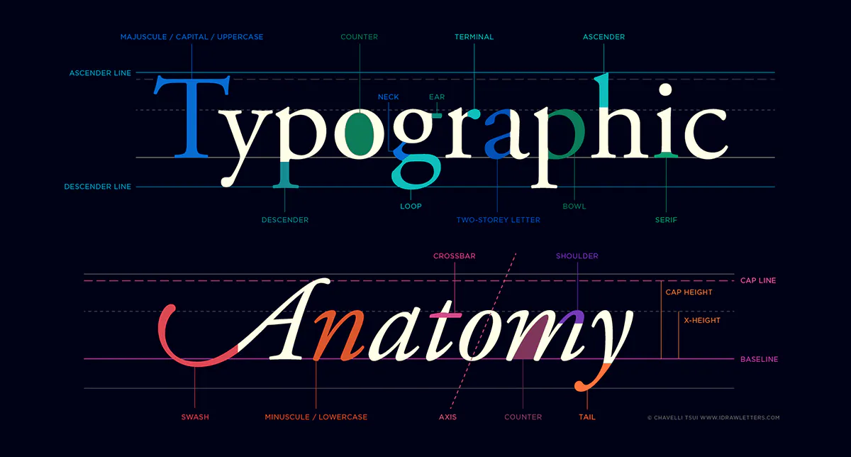
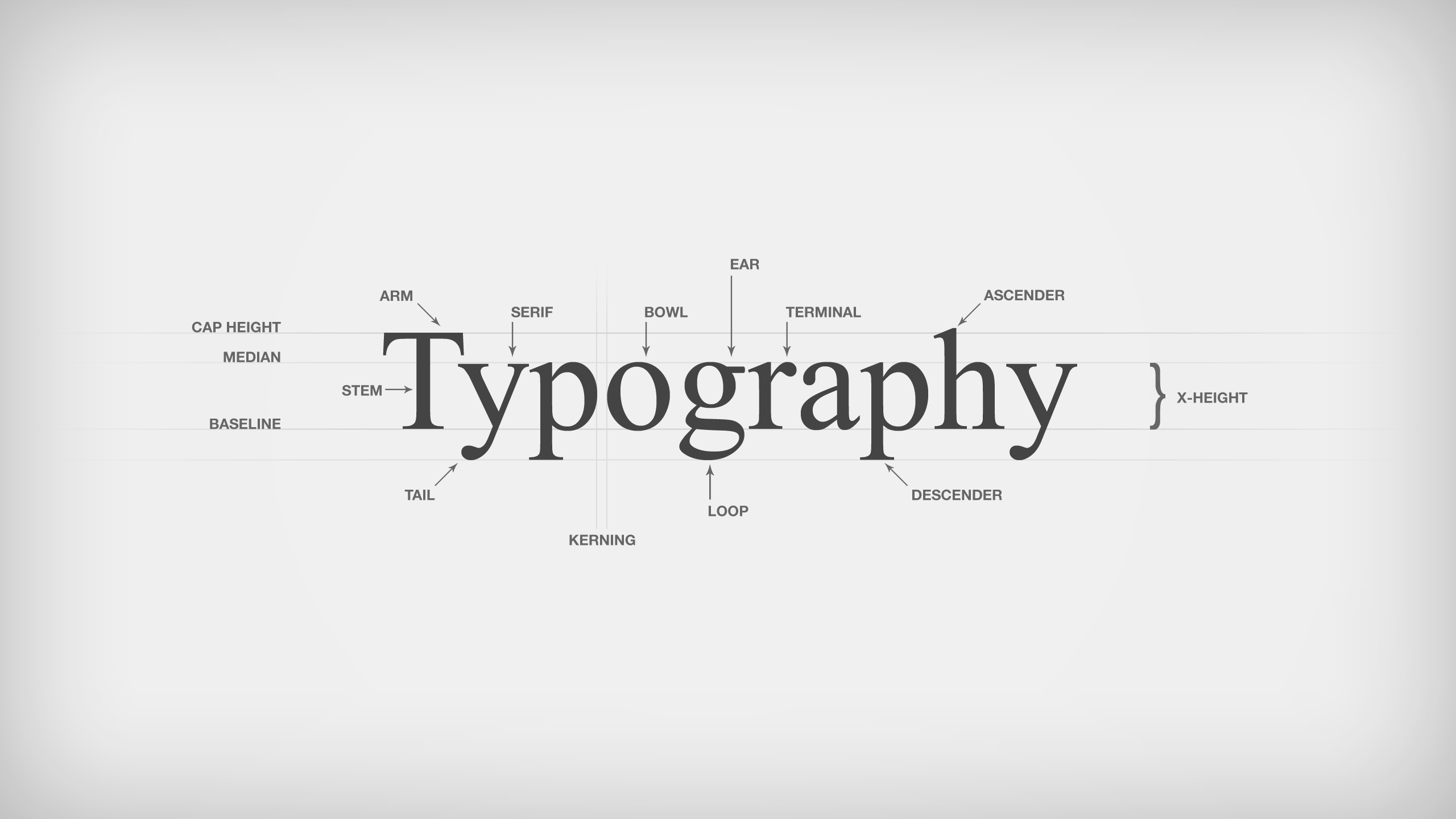
Key Typography Anatomy Terms (with Examples)
Here are the essential type anatomy terms every designer should learn early — along with examples and tips.

1. Baseline
Definition: The invisible line that letters rest on. All characters (except descenders) align here. In the word “design,” letters like “e” and “n” sit perfectly on the baseline, while “g” drops below.
Tip: Align all body text to the same baseline for clean, structured layouts.
2. X-height
Definition: The height of the lowercase “x” — it defines the body of lowercase letters. Fonts with a large x-height are more legible, especially on small screens or in dense layouts. A 2003 study by Bernard et al. (Wichita State University) found that fonts with taller x-heights increased reading speed and comprehension for web users.
Tip: For UI or mobile designs, choose fonts with high x-height (e.g., Open Sans, Roboto).
3. Ascender
Definition: The part of a lowercase letter that rises above the x-height — like in “h”, “k”, or “l”.
Tip: Increase line-height (leading) slightly when using fonts with tall ascenders to prevent visual clutter.
4. Descender
Definition: The portion of a letter that extends below the baseline (e.g., “y”, “p”, “g”). Avoid cutting off descenders in tight vertical spaces like buttons, captions, or callouts.
5. Leading (Line Spacing)
Definition: The vertical space between lines of text. The term comes from metal typesetting, where strips of lead were inserted between lines.
Best Practice: For body text, 120% to 150% of the font size is ideal.
Too little leading = crowded, unreadable text. Too much = loss of visual unity.
6. Kerning
Definition: The adjustment of space between individual letter pairs.
Use Case: Essential in logo design, headers, and large text. Letters like “A” and “V” often need manual kerning due to their shapes. In tools like Adobe Illustrator or Figma, use “Optical” kerning as a base, then fine-tune manually.
7. Tracking (Letter-spacing)
Definition: The consistent spacing between letters across a word or block of text.
Difference from Kerning: Kerning is individual letter-pairs; tracking applies globally. Tighten tracking for body text (especially on print) and loosen slightly for uppercase titles or display fonts.
How Type Anatomy Affects Readability & Accessibility
Type anatomy doesn’t just look nice — it has real impact on how people read.
- Fonts with open counters (like in “e” or “a”) improve legibility in small sizes.
- Humanist sans-serif fonts (like Tahoma, Verdana) have greater character distinction — useful for visually impaired users.
- According to Microsoft’s readability research, fonts with generous x-heights, tall ascenders, and clear terminals perform better in long-form reading.
Design Tip for Students: If you’re designing for educational content, mobile apps, or captions — always prioritize readability. Choose typefaces optimized for screen legibility and keep x-height, counter space, and stroke contrast in mind.
The Role of Optical Adjustment in Typography
Type design is not purely mathematical. It’s optical.
For example:
- Rounded characters like “O” or “C” actually extend slightly above and below the baseline/x-height to appear visually balanced. This is called overshoot.
- Vertical stems are slightly thicker than horizontal bars to look consistent in weight.
Why it matters:
When spacing or aligning type, your eyes matter just as much as the numbers.
Practical Takeaway:
Don’t trust rulers alone. Zoom out of your design — does the word look aligned, even if it’s mathematically centered?
Common Typography Mistakes Beginners Make
Let’s fix what we often get wrong:
1. Using Fonts with Poor Contrast
- Thin strokes at small sizes = hard to read.
- Solution: Use medium-weight fonts or increase contrast in background.
2. Ignoring Line Spacing (Leading)
- Cramped text is a huge readability killer.
- Solution: Set your line-height to at least 1.4x for paragraphs.
3. Default Kerning in Logos
- Logo letters often look “off” when default kerning is used.
- Solution: Manually kern in design software. Zoom in, adjust optically.
4. Mixing Fonts with Mismatched Anatomy
- Combining a font with tall ascenders and another with short x-height creates imbalance.
- Solution: Study your fonts. Match typefaces with similar proportions.
Typeface Anatomy in Serif vs Sans Serif Fonts
Font Style | Key Anatomy Traits | Student-Friendly Example Fonts |
Serif | Includes terminal strokes (serifs), contrast in strokes | Times New Roman, Playfair Display |
Sans-serif | No serifs, clean edges, even stroke width | Roboto, Inter, Open Sans |
Display | Decorative and expressive, may break rules | Bebas Neue, Lobster, Abril Fatface |
Pro Tip:
Use serif fonts for long-form print or editorial. Use sans-serif fonts for screens and minimalist designs. Use display fonts sparingly and only for headings.
Mini Challenge: Spot the Anatomy
Pick a line of text from any of your current designs. Now zoom in and answer:
- Can you identify the x-height, baseline, ascenders, and descenders?
- Does your leading look too tight or too loose?
- Are there any weird kerning gaps?
- Is your typeface too thin or too decorative for the context?
Fix any one mistake and compare your layout before and after. Post the revision on your student portfolio or social page — you’ll notice the polish immediately.
Bonus Practice: Typography Anatomy Worksheet
To help reinforce your learning, here’s a self-guided mini worksheet:
- Pick any two fonts (one serif, one sans-serif).
- Write the word “playground” in both.
- Use lines to mark: Baseline | X-height | Ascenders | Descenders
- Label one optical illusion (like overshoot).
- Annotate: Which one is more readable? Why?
This single exercise helps train your visual sensitivity.
Final Thoughts: Learn to See Type Like a Designer
Typography is where design stops being about decoration — and becomes about decision.
Every pixel of spacing, every curve of a letter, every choice of line height… it all adds up to how clearly your message is communicated.
Once you learn the anatomy, you stop guessing and start adjusting with confidence.
Ready to Go Deeper?
If you found this useful, the GrowthClub community is where beginner and student designers get hands-on with real-world design skills. Weekly challenges
Free resources
Creative feedback loops
Deep dives like this — every week
[Join GrowthClub Now] – because every confident designer starts with the basics.
SEO Recommendations & Incorporation Strategy:
Element | Primary Keyword | Secondary Keywords | How to Integrate in Blog |
Main Title | typography anatomy | type anatomy, design students | Use naturally in intro + headings |
Meta Description | type anatomy guide | typography terms, beginner typography | Add a 150–160 character meta description summarizing the guide |
H2 Subheadings | typography terms | baseline, x-height, ascender, descender | Use H2s/H3s for each key term to help with indexing & readability |
Image ALT Text | type anatomy illustration | typography diagram, font anatomy | Label visual examples meaningfully |
Internal Linking | design student tips | beginner design guide, typography basics | Link to related GrowthClub blog content if available |
CTA Phrases | learn typography | improve design skills, design like a pro | Add in challenge/CTA sections naturally |