What You Don’t Know: Font Pairings That Actually Work
The Proven Psychology and Practice of Typeface Pairing for Better Design Outcomes
The Silent Power of Pairing
You’ve designed a sleek portfolio with clean visuals and carefully placed elements. But somehow, it still doesn’t “click.” It feels… unfinished. Flat. It’s likely not your layout—it’s your font pairing. In design, typography does more than convey words. It shapes perception. According to a 2012 study by Schaik & Ling, users form an impression of a website in as little as 50 milliseconds, with typography playing a crucial role in that snap judgment. When done well, font pairing can elevate your design, guide your viewer’s eye, and build visual harmony. When done poorly, it can ruin readability and make your work feel amateur. This blog breaks down the proven frameworks, psychology, and real-life use cases to help you master the art of typeface pairing. Because knowing design is great—and knowing how to make fonts work together? That’s foundational groundwork that makes design WORK.
Why Font Pairing Matters More Than You Think
Typography isn’t just visual. It influences cognition and emotion. The Nielsen Norman Group emphasizes that readability and scannability are key to content retention—and font pairing directly affects both.
Case in point: the Spotify Design Blog redesign. They used Circular for headlines to evoke friendliness and Graphik for UI content to ensure clarity. The result? Smoother navigation and stronger visual hierarchy. According to a 2020 MIT/Google UX Study, good typography increases reader engagement by up to 30%. That’s a powerful incentive to make font pairing an intentional part of your design process.
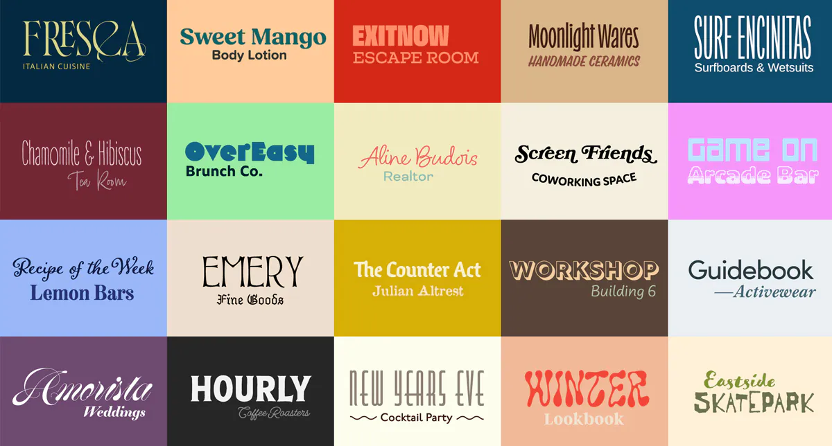
Understanding Font Categories: The Basics You Can’t Skip
Before pairing fonts, you need to know what you’re working with. Here are four foundational font categories:
1. Serif Fonts
Serifs are the fonts with the little “feet” or strokes at the end of each letterform. They’ve been around for centuries, and they carry that heritage with pride. Serif fonts often feel serious, classic, and authoritative — think of academic institutions, established newspapers, or high-end fashion brands. When a serif font shows up, it signals, “We’ve been doing this for a while — and we know what we’re doing.” If you’re designing for something that wants to feel trusted and timeless — a luxury brand, a legal service, or a high-concept editorial piece — a serif font is usually a safe bet. For example, pairing something like Playfair Display for headings with a clean sans-serif like Source Sans Pro for body text gives you a beautiful blend of classic elegance and modern readability.
2. Sans-Serif Fonts
In contrast, sans-serif fonts are stripped-down and clean. No decorative strokes, no extra flair — just simple letterforms that feel modern, neutral, and accessible. These are the fonts you see on websites, apps, dashboards, and most tech brands. If serif fonts wear tailored suits, sans-serifs show up in minimal streetwear — sharp, approachable, and contemporary.
They’re incredibly versatile, which is why brands like Apple, Spotify, and Google all lean on them heavily. If you’re working on a presentation, an interface, or a brand that wants to feel progressive and easy to understand, a solid sans-serif like Montserrat, paired with Roboto or Inter, gives you structure without stiffness.
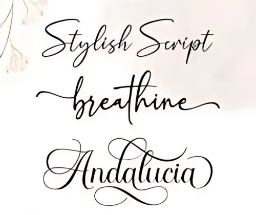
3. Script Fonts
Script fonts mimic handwriting, and that human touch makes them feel warm, expressive, and often emotional. They range from elegant calligraphy to casual, brush-lettered styles. When used well, they bring intimacy and personality into the design — the kind of type that feels like a handwritten note or a signature on a boutique package.
But script fonts come with a warning: they’re not always easy to read, especially at small sizes or in long sentences.
That’s why they’re best used for accents — maybe a logo wordmark, a short heading, or a quote — rather than paragraphs. A light script font like Allura, when paired with a grounded serif like Lora, creates a graceful blend of emotion and structure.
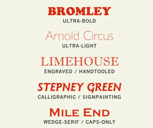
4. Display Fonts
Display fonts are the showstoppers. They’re bold, attention-grabbing, and often quirky or decorative. You’ll find them on posters, banners, headlines, and packaging — anywhere that needs to make a visual impact quickly. They’re not built for subtlety or body text, but they are built to be memorable.
Because display fonts tend to have strong personalities, they work best when balanced with something more neutral. For example, using a heavy display font like Anton for your headline, then following it with a lightweight sans-serif like Poppins Light for your supporting text, can create a layout that’s dramatic but not overwhelming.As a rule of thumb: let one font lead with personality, and let the other quietly support it. That’s the balance that keeps your design intentional, readable, and emotional.
The Science of Contrast: 5 Reliable Ways to Create Balance
In typography, contrast isn’t decoration — it’s structure. It’s what helps a viewer navigate your content, instantly understand what’s important, and engage with your message more naturally. Without contrast, your type can look dull, confusing, or just plain forgettable.
Here are five dependable ways to create balance through type-based contrast — whether you’re working on a brand identity, website, or a single Instagram graphic.
Type of Contrast | Example | Why It Works |
Style | Medium uses Noe Display (Serif) for headings + Franklin Gothic (Sans) for body. | Noe is elegant and attention-grabbing; Franklin is neutral and easy to read. |
Weight | Airbnb uses Cereal Bold for headers + Cereal Light for body text. | Variation within the same family keeps it visually consistent yet readable. |
Size | Apple product pages: Big bold names + smaller spec text in San Francisco font. | Creates immediate hierarchy and improves visual flow. |
Function | Different fonts for headlines, body, nav bar, CTA, captions. | Assigning fonts by purpose brings clarity and strengthens structure. |
Tone | Vogue: Modern Didot + sans-serif for high fashion feel. Vogue Business: Simplified sans-serifs for corporate tone. | Same brand, different pairings = distinct emotional identities. |
Font Pairing Frameworks That Actually Work
Pairing fonts isn’t about choosing your two favourites and hoping they vibe. It’s about creating visual hierarchy, emotional tone, and functional contrast — all while keeping your design cohesive. That’s easier said than done, especially when you’re staring at hundreds of font options.
To make it simpler, here are a few reliable font pairing frameworks used by well-known brands/organizations— with examples and reasoning behind why they work.
Framework | Use Case | Font Pairing | Why It Works |
Classic Contrast | The Guardian | Guardian Egyptian (Serif) + Guardian Sans | Creates a balance of authority and readability—ideal for editorial content. |
Modern Editorial | Medium.com | Noe Display + Franklin Gothic | Visually compelling, blends classic charm with modern functionality. |
Corporate Minimal | Slack | Larsseit + Helvetica Neue | Clean, accessible, and consistent with a tech-forward corporate tone. |
Creative Portfolio | Tobias van Schneider | GT Super (Display) + Suisse Int’l (Sans) | Combines expressive personality with high legibility—perfect for personal brands. |
Adobe research found that serif + sans-serif pairings appear in 56% of high-performing brand designs—making them the most reliable combo in professional design.
6. What to Avoid: Common Font Pairing Mistakes
Even strong visuals can fall flat if your typography choices create confusion or fatigue. Here are some of the most common pitfalls—and how to fix them:
Mistake | Real-World Example | Why It Fails | Better Practice |
Using fonts that are too similar | Arial + Helvetica in presentations | Minimal contrast causes visual monotony and poor hierarchy | Pair Arial with Playfair Display for contrast |
Overusing display fonts | Early Behance portfolios | Display fonts are decorative—too many make the design feel chaotic | Use 1 display font with 1 neutral sans-serif |
Decorative fonts in body copy | Long-form articles with cursive fonts | Hard to read, especially on mobile and small screens | Limit decorative fonts to headings or logos |
Skipping functional roles | Same font for all text elements | Lacks structure and fails to guide the reader’s eye | Assign fonts by function (headline, nav, CTA) |
Not testing across devices | Designs that look great on Figma only | Fonts may render poorly on phones or different browsers | Always test on multiple devices + screen sizes |
Tip: Fonts that look “close but not the same” confuse the eye. According to Nielsen Norman Group, overly similar fonts reduce scannability and readability by 20–30%, especially in dense or content-heavy layouts.
7 Tools and Resources for Font Pairing
Whether you’re experimenting or working on a real-world client project, the right tools can simplify and elevate your font pairing decisions. Below is a curated toolkit to help you find, test, and learn from great typography.
Font Pairing Tools
Tool | What It Does |
Fontjoy | AI-powered tool that uses GANs to generate intelligent font pairings instantly. |
Typ.io | Pulls real examples from live websites, showing how designers use fonts in context. |
FontPair.co | Curated Google Fonts pairings—great for free and web-safe projects. |
Adobe Fonts | Offers professional-quality typefaces with official pair suggestions and sync support. |
Typography Learning Resources
Resource | Why It’s Valuable |
FontsInUse.com | Deep archive of real brand examples—filter by industry, type, or media. |
Typewolf.com | Curated font pairings, site inspiration, and font usage trends—great for staying current. |
Lapa Ninja | Showcases top UI/UX landing pages—helpful for font application in modern layouts. |
Better Web Type | Offers email courses and articles on web typography fundamentals. |
Use these tools not just to find fonts—but to understand how and why they work together.
Practical Typography Exercises for Students
Apply what you learn:
A. Redesign a Famous Poster– Use new fonts to elevate a TED Talk, Netflix show, or Apple event poster.
B. Rebuild a Brand Font Guide– Choose a startup and create your own version of their typographic style.
C. Analyze FontsInUse– Pick 3 real-world examples. Note what works, what clashes, and why.
D. Reverse Pairing Fix– Start with a bad pairing. Fix it with contrast, weight, or tracking.
Conclusion: Pair With Purpose—Your Design Depends on It
By now, you’ve gone beyond just picking pretty fonts. You’ve explored the psychology behind font pairings, seen real-world examples, and learned how balance, contrast, and intent can transform your work. Whether you’re building a portfolio, redesigning a landing page, or creating for a client—your font choices speak before your content does. And the right pairing can:
- Instantly improve readability | Boost emotional connection | Strengthen your visual hierarchy | Build trust and brand perception
This blog isn’t about memorizing combinations—it’s about building your judgment. Now, you know what to pair, why to pair it, and how to test it.
If you want your designs to be taken seriously, font pairing is not optional—it’s foundational.
So go back to that “flat” design. Tweak the type. And watch the story come alive.